You might have noticed that the SQA have announced updates to the detailed marking instructions for the Higher Applications of Maths Project. Here I’ll point out what has changed and give some thoughts. The main thrust of the change is make things clearer for students who are working with categorical data, and I think the changes will be welcomed by teachers.
Subjective Impression
There are three changes here. The first concerns the graphical displays to be produced:

Here they clarify that a contingency table counts as a graphical display, and also suggest that a line graph can be used the achieve the second mark when studying bivariate data.
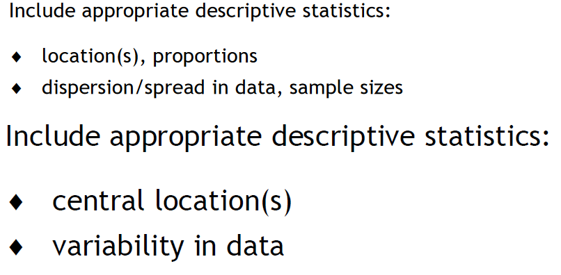
A significant change is the inclusion of proportion and sample size:

Let me make this clear: If you are writing a project about categorical data, then include information about your proportions and state your sample size!
The final change for the subjective impression is replacing “variability” to “dispersion/spread”, which better matches the course spec.
Analysis and Interpretation
Instead of saying “Perform appropriate tests and present additional statistical information” for two marks, it has changed to make where marks come from much clearer. You now get one mark for making the appropriate choice of test, and then one mark for correctly generating output for that test.
I’ll share an example to explain how I’m taking this. Student A is comparing two means, and decides to do cor.test in R. Student A types cor.test into R and generates a p-value and states the regression line. Student A would fail to get mark 1 (she’s done the wrong test) but would get mark 2 (she’s demonstrated she is able to generate an output for the test she has said she will do). Student A does not lose two marks for making one mistake.
Another change is the inclusion of “comparing proportions” under “descriptive statistics”. This again is about clearing up where marks can appear for categorical data. If you are writing a project on categorical data, state the proportions and make a comparison as part of the analysis.
Presentation
The change in wording is small, but it’s a really significant one: “Include bibliography AND appendix of data” (my emphasis!). Before it was “or” rather than “and”. Students must include an appendix. Being realistic, if the dataset used is massive, then include 10 or so rows as an appendix and give details on how to find the full set. But the appendix has to be there.
This is for the benefit of markers, who will want to see some of the data to try and get to grips with what the students were attempting to do. This should also benefit students as it might make some of their projects a little more intelligible.
Bryn
